Falls of the Ohio Foundation: Rebrand
-
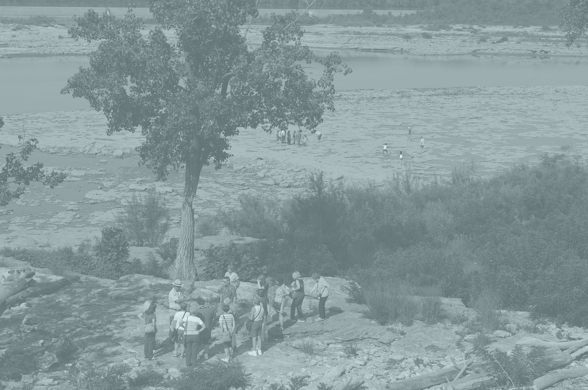
The Falls of the Ohio is a one-of-a-kind State Park stationed along the Southern Indiana banks of the Ohio River. It provides unique opportunities to explore a wealth of natural, cultural, and historic artifacts, exclusive to the region. From public-access fossil beds and an Interpretive Center where you can discover millions of years of natural history, to outdoor recreation and activities, and even coordinated educational programs and events, The Falls has so much for anyone to explore. What is lesser-known, this local and national gem is largely due in part to the Foundation behind it all: The Falls of the Ohio Foundation.
The Foundation initially wanted a rebrand that would distinguish themselves from the Park itself, while also acknowledging the distinct, interconnected relationship between the two. In short, they wanted us to position them as a reflection of everything The Falls is and does, but with the more buttoned-up, professional look of a foundation. This created a dance for us to find the right balance between “Park” and “Foundation” while also creating a look and feel that was unique in the world.
Our approach for the mark became a summation of the story for who they are and why they exist. It’s a showcase of their mission and their location: four lines to represent the four local regions The Foundation serves and where they all join together (literally and figuratively) at The Falls, while simultaneously tracing the segmented shape of the Ohio River at the pinpointed spot where the park falls on the map. To further communicate the story and position of the Foundation, we went on to partner with them to craft new Mission and Visions for the organization, to better reflect this new era of identity and cohesion between the brand’s look and overall messaging.
-
Strategy
Logo Concepts & Design


